About the project
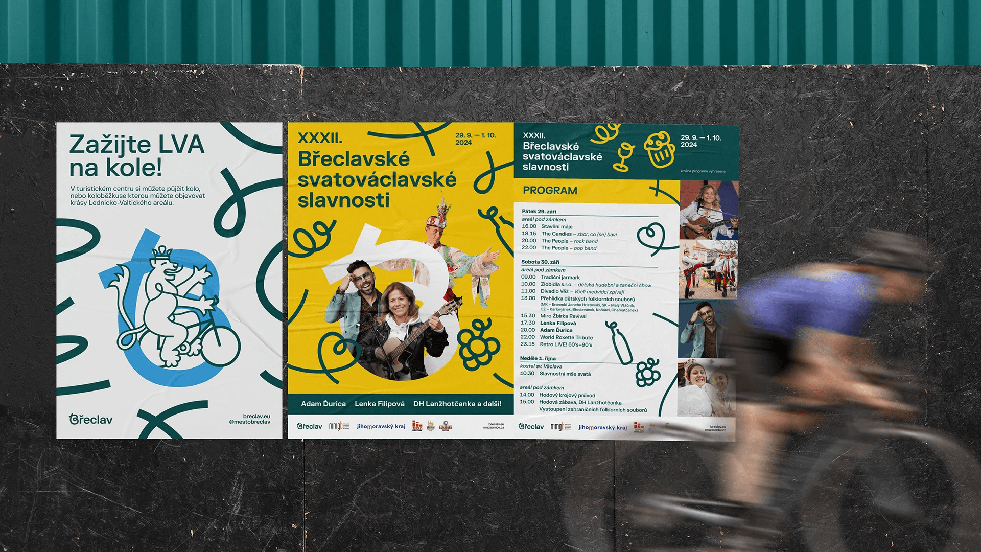
The visual concept of Břeclav's identity is built on a playful letter B. It is the initial letter of the city, which, through the specific shape of the letter, refers to the fact that Břeclav was historically considered a transport hub ("all roads, waterways, railways lead through Břeclav"). However, the junctions are not visualized in a way that is austere or technical. Instead, they are organic and winding, just like life itself. At the same time, the letter B also represents a bunch of grapes, referring to wine, a typical local beverage - and a heart, suggesting the friendliness and relaxed nature of the city's inhabitants.




© Nestydo 2025